Table of Contents
- Vintage Screen Printing vs Standard Prints: What You Actually Pay For
- Soft Hand Screen Printing vs Plastisol: Which Feel and Finish Lasts
- Techniques That Create the Distress Effect and Duotone Look
- Total Cost of Ownership: Vintage Prints vs Standard Prints Over Time
- How to Wash Graphic Tees So the Print Survives
- How to Explain the Price Difference to Your Customers
- Conclusion
- Frequently Asked Questions
Last Updated: September 25, 2026
Vintage Screen Printing vs Standard Prints: What You Actually Pay For
If you run a print shop or sell graphic tees, you’ve heard the question: is vintage style screen printing worth the extra cost? The short answer is yes, but only when the design and the customer call for it.
A vintage screen print is a garment printed to look and feel worn from day one: softer ink, faded colors, a lived-in design.
That worn look comes from real choices in the shop, not a filter, and those choices add setup time and labor. The price gap is real, and it needs a reason.
Below, we break down where the extra money goes and when it pays you back.
Setup Costs and Production Runs
Setup is the first place vintage work costs more. A standard print needs one screen per color and a quick pass on press. A vintage print often needs extra steps: a distress screen, a second hit, or a base layer.
Those steps add labor to every run. On a small run the cost spreads across fewer shirts, so each one costs more; on a large run the same setup spreads out and the gap shrinks.
Here’s the trade-off in plain terms:
- Small run (under 100 pieces): setup dominates, vintage costs much more per shirt
- Mid run (100-500 pieces): setup spreads out, the gap narrows
- Large run (500+ pieces): setup is minor, ink and labor drive the cost
The lesson is simple. Vintage printing rewards volume.
Printful’s guide to screen printing methods
Ink Opacity, Additives, and Mesh Count
Ink opacity is how much light the ink blocks. High opacity covers the shirt; low opacity lets the fabric show through. Vintage looks want that see-through quality, so printers use less opaque ink.
To get a soft, faded finish, shops often add a fading agent to the ink. This thins the color and drops the opacity. The same effect comes from a higher mesh count, which lays down less ink per pass.
Both tricks mean the print wears faster if you’re not careful: you get the look, but you give up some durability unless the ink and cure are dialed in.
A common mistake is over-thinning the ink to chase the look. It fades too fast and cracks early. The right balance takes testing.
Soft Hand Screen Printing vs Plastisol: Which Feel and Finish Lasts
Soft hand screen printing vs plastisol comes down to feel versus lifespan, but the durability gap is narrower than most guides admit, and it depends almost entirely on cure, not ink chemistry.
How each ink sits on the fabric
- Plastisol is a PVC-based ink that stays on top of the cotton, forming a plastic film that bridges the weave. That film is thick, opaque, and strong, which is why plastisol holds bright color and survives hundreds of wash cycles. The trade-off is hand feel: that film is what you feel when you run a finger across the print.
- Water-based ink penetrates the cotton fibers and cures inside the fabric rather than on top of it. There is almost no film, so the print feels like the shirt itself, and the color sits in the fiber, the vintage look is a byproduct of the chemistry, not an added effect.
- Discharge ink goes a step further: it removes the garment dye and replaces it with pigment, so the print has zero hand and takes on the shirt’s texture. It only works on cotton dyed with dischargeable dyes, which rules out many poly blends and most pigment-dyed garments.
Why soft-hand prints seem to fade faster
The wash-cycle reality
A common pattern shops report:
- Properly cured plastisol: holds color and shape through 50+ home washes with minimal cracking.
- Properly cured water-based or discharge: holds through a similar range, but the color continues to soften and fade gradually, which is the intended vintage look, not a defect.
- Under-cured ink of any type: visible cracking, flaking, or wash-out within the first 5-10 cycles.
Choosing for the job
- Want the worn, soft look and the shirt is 100% cotton? Go water-based or discharge.
- Want max durability and bright color on a poly blend or performance fabric? Go plastisol.
- Want both the look and a thicker hand? Use plastisol with a distress screen and accept the film.
- Selling to a customer who washes hot and tumbles dry? Plastisol buys you more margin for error.
What most guides miss: the cure matters more than the ink. Under-cured ink cracks and washes out fast, no matter which type you use. Check your cure temp with a heat gun or temperature tape before you blame the ink, and test-wash a sample from every new ink batch.
American Apparel & Footwear Association guidance on textile care labeling
Techniques That Create the Distress Effect and Duotone Look
The distress effect and duotone look come from a few repeatable techniques. None need fancy gear, just practice.
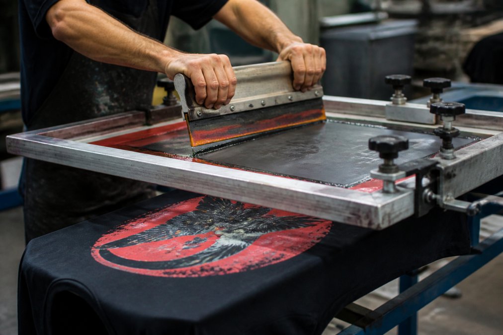
The main methods:
- Distress screen: a screen with a worn pattern that blocks ink in random spots
- Faded base: print a light base layer so top colors look washed out
- Duotone: print two tones of one color to fake an old photo look
- Single print stroke: one firm pass for a thin, even layer
- Additive fade: mix a fading agent into the ink
Total Cost of Ownership: Vintage Prints vs Standard Prints Over Time
Total cost of ownership is where vintage prints often win. The sticker price is higher, but the shirt lasts and the design stays in demand.
Here’s the ROI view most shops skip:
| Factor | Vintage Print | Standard Print |
|---|---|---|
| Setup cost | Higher | Lower |
| Per-unit cost (small run) | Higher | Lower |
| Per-unit cost (large run) | Closer | Lower |
| Retail value | Higher | Standard |
| Design lifespan | Longer trend | Shorter trend |
| Durability (with good cure) | Good | Good |
How to Wash Graphic Tees So the Print Survives
Knowing how to wash graphic tees is the cheapest way to protect a vintage print. The wrong wash kills a good print in weeks.
Follow these rules:
- Turn the shirt inside out before washing
- Use cold water, never hot
- Wash on a gentle cycle
- Skip the dryer, or use low heat
- Never iron directly on the print
- Skip bleach and harsh detergents
Hot water and a hot dryer will crack and fade a vintage print fast. If a customer ignores this, they’ll blame your print, not their wash cycle. Put a care card in every order.
How to Explain the Price Difference to Your Customers
Explaining the price gap is a skill, and most shops fumble it by defending the process instead of selling the outcome. Lead with what the customer gets, name the one or two production facts that justify it, then close with care instructions. Here is a playbook for the counter, the product page, and the wholesale pitch.
The three-part structure
Every explanation should hit three beats in this order:
- The outcome, what the shirt looks and feels like, in plain language.
- The reason, one production fact that explains the cost, not a lecture.
- The care promise, how to keep it looking that way, which also reduces returns.
Counter script (retail, in person)
Product page script (online, e-commerce)
Wholesale script (B2B, buyer or brand)
Handling the three objections you will actually hear
- “Why is this one more than that one?”, Point to the extra screen and the softer ink, then to the feel. Let them touch both shirts. The hand feel closes the sale faster than any script.
- “Will it fade?”, Reframe: it is supposed to fade gradually, that is the look. What it will not do is crack or flake if it is washed cold. Hand them the care card.
- “Can you do it cheaper?”, Offer the standard print as the alternative, not a discount on the vintage print. Discounting the vintage print trains the customer to expect the premium look at the standard price.
The ROI framing for shop owners
The script is not the point, the order is. Outcome first, reason second, care promise third. Shops that lead with the process lose the sale; shops that lead with the feel and back it with one production fact keep the premium price.
Never promise a vintage print will not fade. It is designed to fade. Promise it will not crack or flake when washed cold, and put that promise on a care card in every order so the customer blames the wash cycle, not your print.
Conclusion
The honest answer to whether vintage style screen printing is worth the extra cost is: it depends on the design and the volume. On small runs, the setup makes it pricey. On larger runs, the gap shrinks and the higher retail value pays you back.
Frequently Asked Questions
What makes vintage screen printing more expensive than standard printing?
Vintage screen printing costs more because it requires extra steps: lower mesh counts, specialty additives, discharge or water-based inks, and sometimes multiple passes to build the faded look. Each pass adds labor and screen preparation time. Setup costs are higher per design, so smaller production runs spread that cost across fewer shirts, raising the per-unit price.
Does vintage screen printing last longer than standard plastisol prints?
Water-based and discharge vintage prints sit inside the fabric rather than on top of it, so they resist cracking and peeling better than heavy plastisol layers. However, the faded look is intentional, so some color loss over time is expected. With proper care, vintage screen printing can outlast thick plastisol prints because there is no raised layer to crack.
How do I wash graphic tees with vintage screen prints without ruining them?
Turn the shirt inside out, wash in cold water on a gentle cycle, and skip the dryer. Heat breaks down the ink bond faster than anything else. Hang dry or tumble on low. Avoid fabric softener because it coats the print and dulls the finish. Following these steps for how to wash graphic tees keeps the vintage look intact for years.
Is vintage screen printing worth it for small production runs?
For runs under 50 pieces, the setup cost per shirt is high because screens and color matching do not scale down. Vintage screen printing makes more financial sense at 100 units or more, where the per-unit cost drops. For very small runs, consider whether the premium look justifies the higher per-shirt price for your brand.